» Download Slides


A Presentation About Responsive Web Design
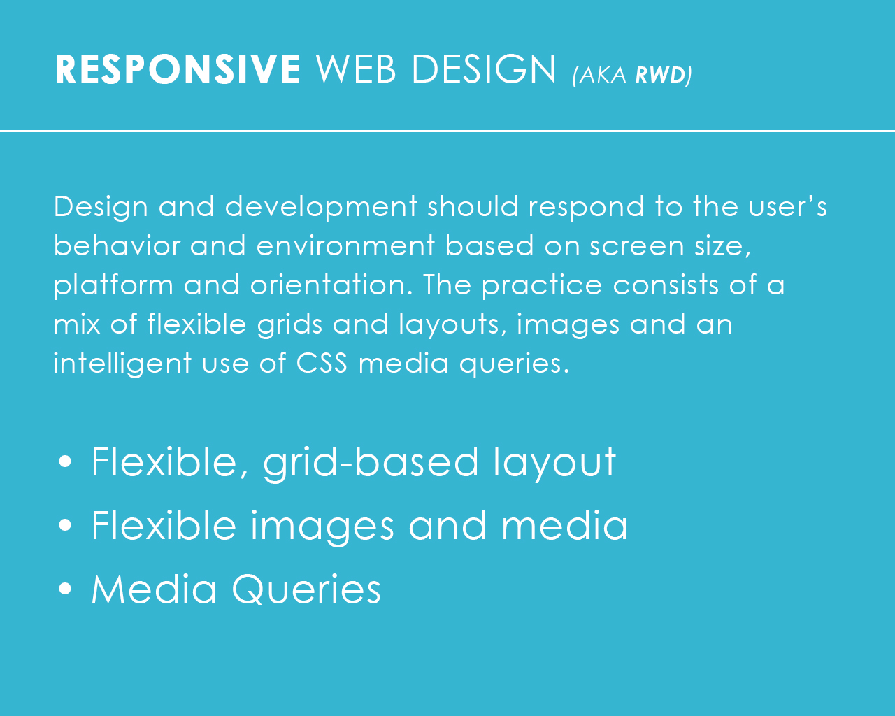
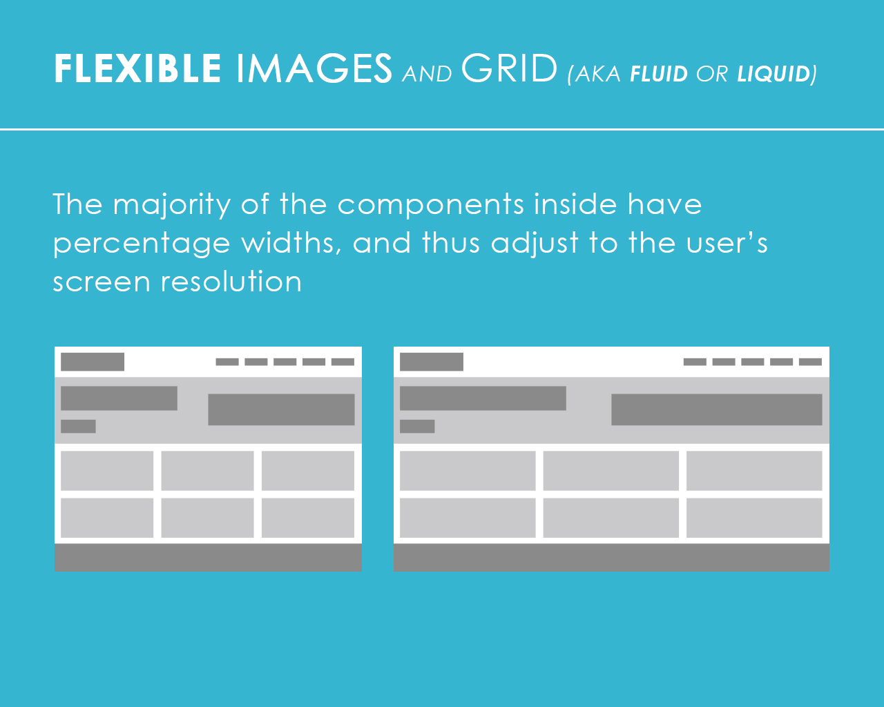
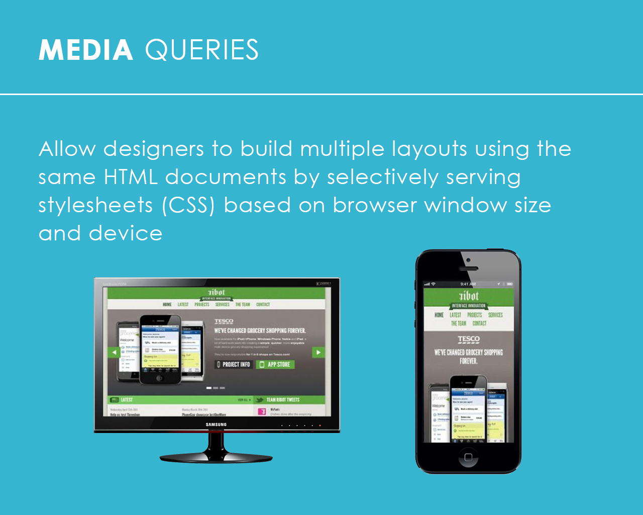
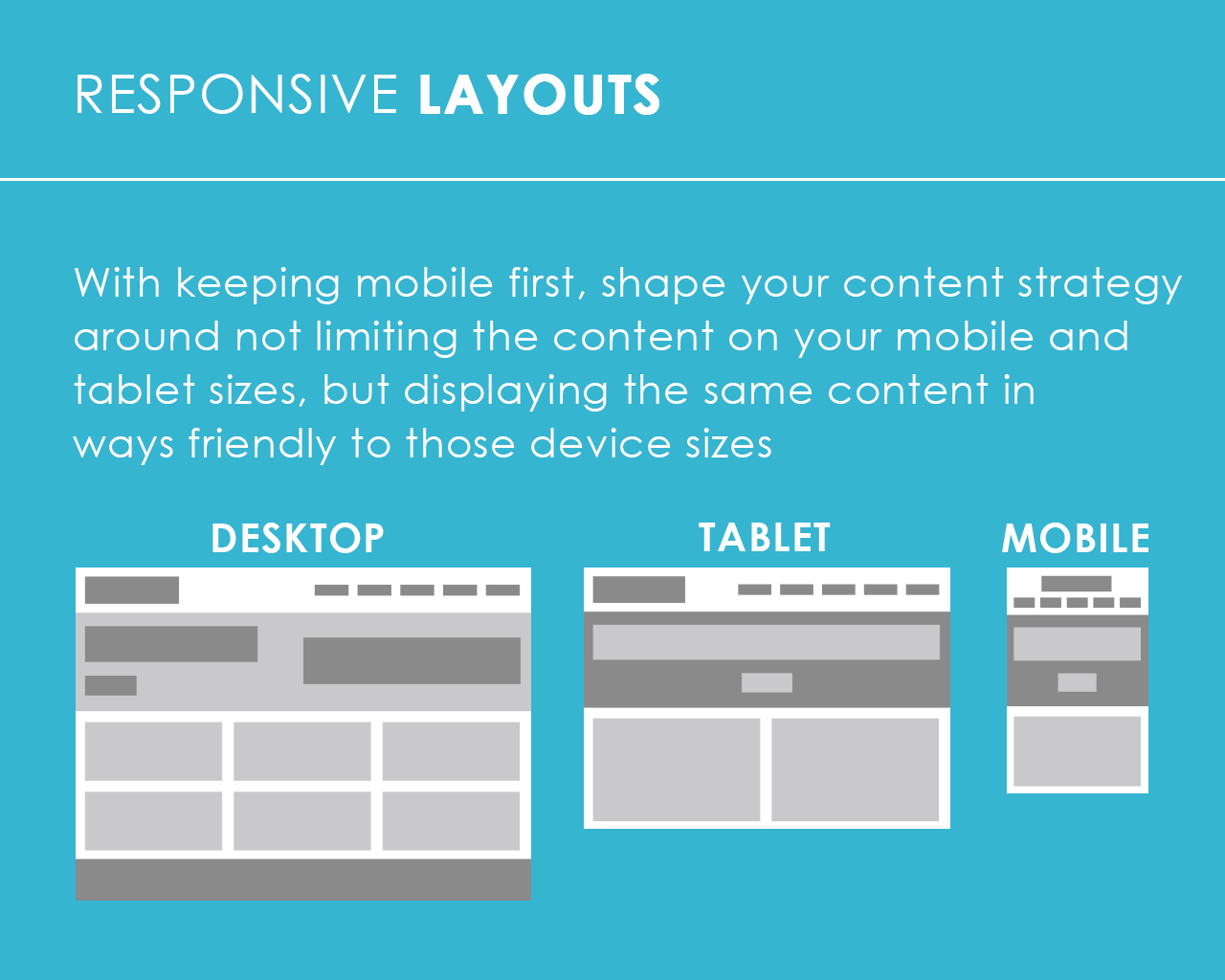
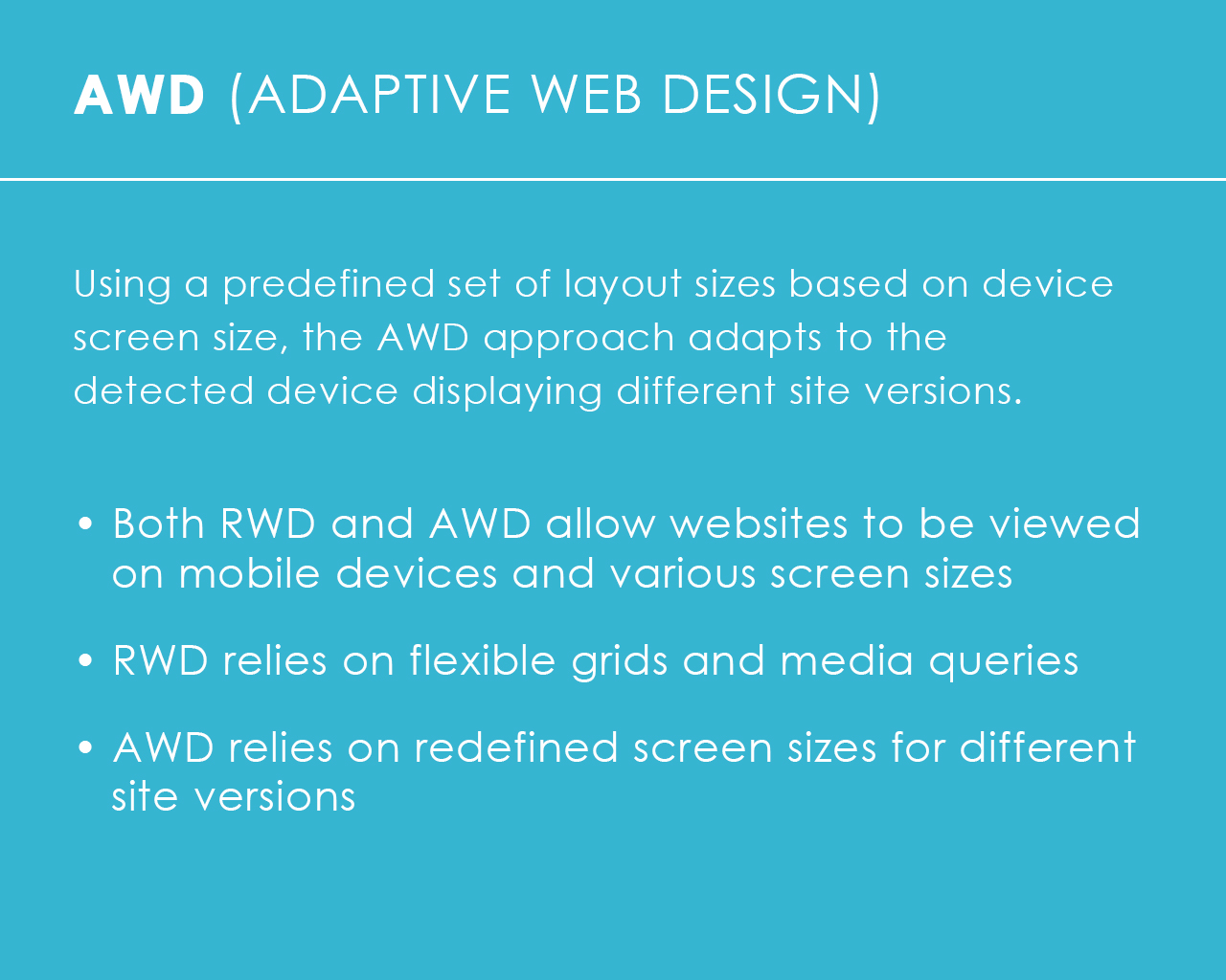
With the fast growth of smart phones and tablets, websites are no longer primarily viewed on desktop or laptop computers. Responsive web design provides a solution that allows a single website to respond to the device and screen you are viewing it on, shifting to a presentation suitable for that device and screen size, as if it was a completely different site just created for it.
I gave an introductory presentation at the monthly August, 2013 SandCHI meeting/event. SandCHI is a local chapter of a national User Experience (UX) organization that I am the current president of. There were three other speakers. These are my slides that are also available for download.
