Mortgage and Personal Loan Applications
for Consumers and Loan Officers
clientloanDepot
research | wireframes | interaction design | visual design | prototyping | usability testing
loanDepot is the second largest US nonbank retail mortgage lender and I designed the experience for their personal loans and mortgages while working as their Head of UX Design. Below are samples of wireframes and high fidelity mockups of unfinished and finished experiences. Some are earlier stages of mockups since I legally can't show more current/developed versions, though these wireframes/mockups do display a lot of the thought process and ideas that carried on to the finished versions.
» ReturnMortgages
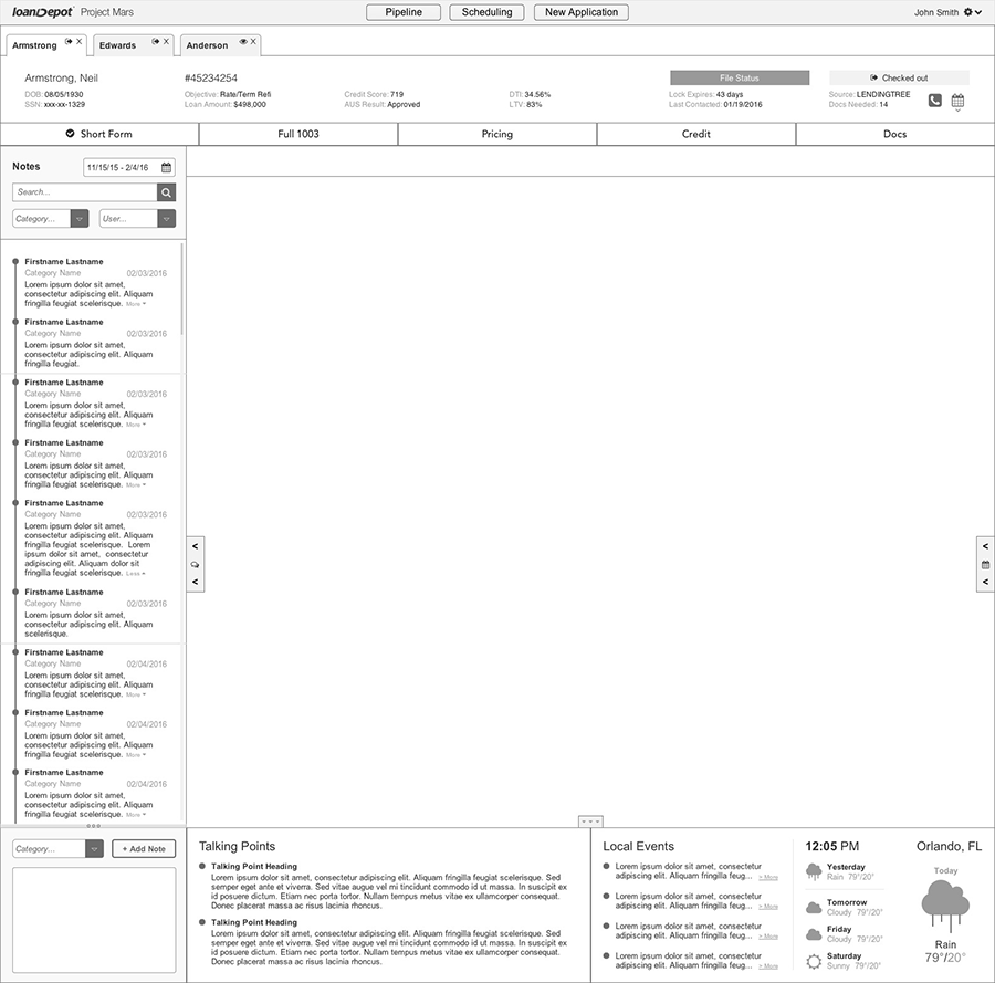
My initial approach is to first find what problems I am trying to solve and then try to create the best user experience around solving these problems. Some of the biggest problems I found in the current systems were that internal LOs didn't have the information they needed always in front of them, when they needed it, and had to go through a lot of clicking, sometimes opening other systems/apps, to access this information. I designed a system that gives easy high-level navigation, then steps/sections that showed progression, then a section with key data in front of them at all times, and then menus/sidebars that expanded with other valuable information such as contextual talking points, a pipeline summary, and lead-specific information. The key data is information that the LO references frequently, such as borrower's name, DOB, last 4 of SSN, loan number, status, etc. The lead-specific information helped build rapport with the borrower and displayed information that was specific to where they live, such as their current time zone time, local weather, local sports/events, etc.
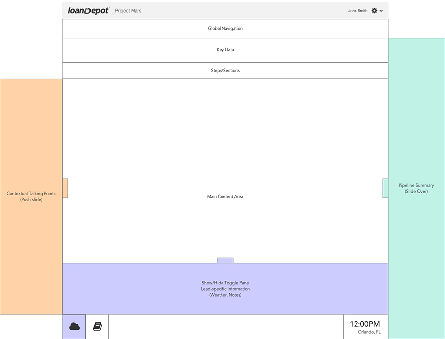
These pull-outs later developed into a robust notes section with contextual talking points grouped with the rapport-building lead-specific information.
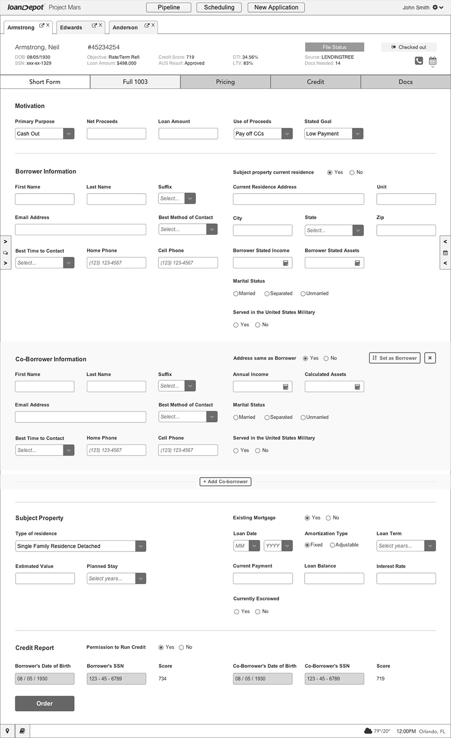
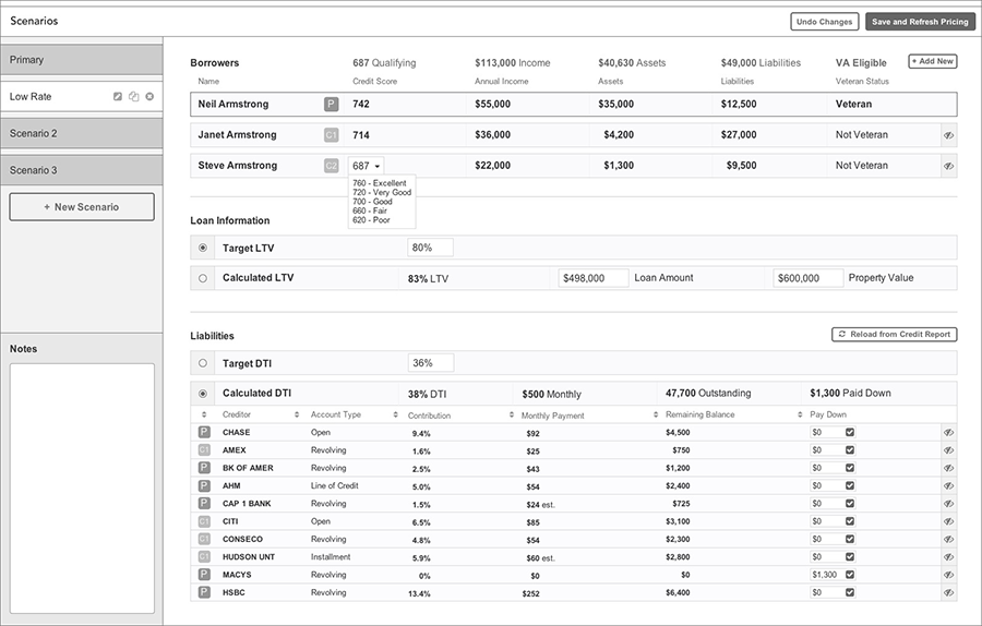
The steps/sections first brought a short 1003 form (also known as "PENCIL data") that had some information possibly pre-populated by the 3rd-party the lead could have come from and and held fields just needed, at a minimum, for an initial credit pull. This short form grouped fields in a much better way than found on a full 1003 and provided an easy experience for the user to quickly fill in fields without jumping all over a full 1003. Then was a step/page for a full 1003 with all needed information, then a breakdown of pricing options, then a step/page outlining items on their credit report, then a page showing scenarios, and finally docs (documents). The idea of showing Scenarios is very important in closing a loan and provides the borrower with possible scenarios where they could obtain a better rate based off of fixing certain aspects of their credit, such as what their rate would be if they eliminated debt found on certain credit cards.
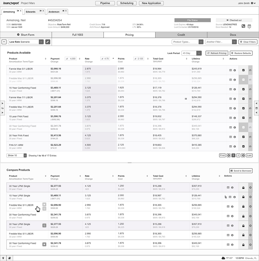
Pricing showed a list of available products as well as allowed a product comparison. The metrics for each column could also be manipulated, such as seeing what the numbers would be with a modified amount of points.
Scenarios would pop out into a new window, since all LOs had multiple screens, and would allow them to view on one screen a full credit report, pricing options, or the 1003, while manipulating different scenarios to help the borrow understand that if they eliminated certain aspects of their debts they might obtain a certain better rate.
Personal Loans
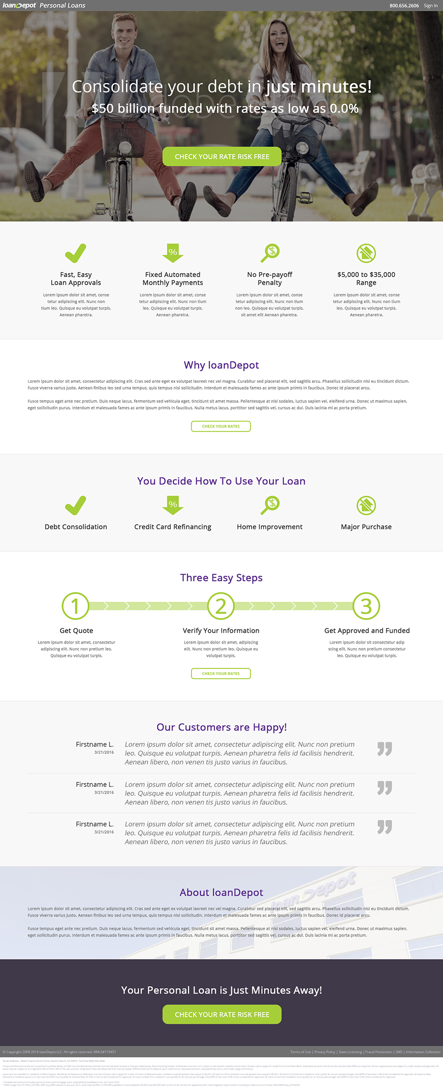
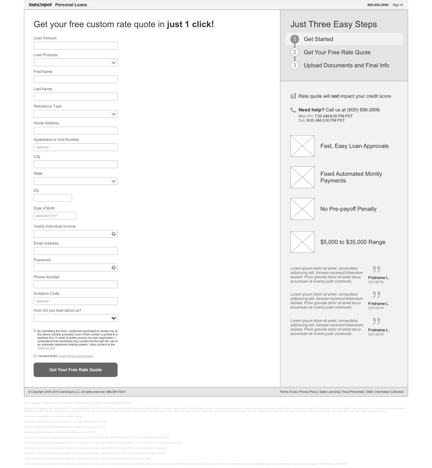
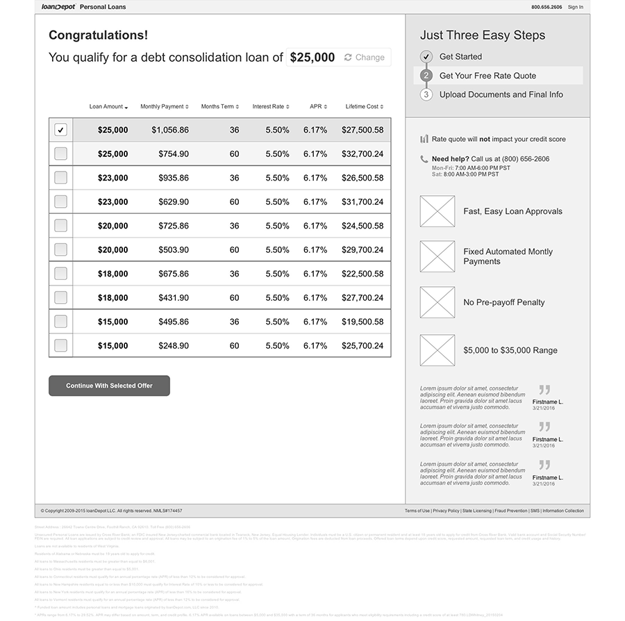
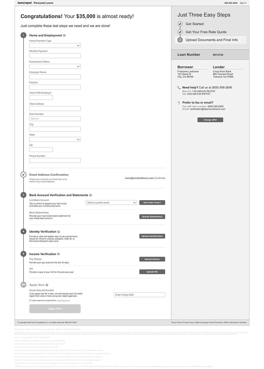
After designing a digital experience for mortgages, I moved on to redesigning the experience for the borrower-facing personal loan application. Below is the current iteration of the visual design, laid on top of the initial wireframe created, for the personal loan application landing page, followed by wireframes of the pages that follow. Placeholder content, images, and icons are in place since these designs are still a work in progress.
